Hey 👋🏻 I’m Harry. My work:
Unified a fragmented funding experience
for Karma
Project info
For Karma
Year 2025
Role Product Designer
UX, UI, Frontend Development, Product Strategy
With Mahesh Murthy / Founder
Frontend Engineer / Implementation
Overview
Deeper issues found beyond the brief
The brief was to redesign one page—what I found were two fragmented experiences with completely different behaviors and no consistent routing, so I recommended consolidating both into a unified flow where all programs route through dedicated round pages, creating consistent patterns and a conversion layer where none existed.
Key outcomes
- Unified discovery flow replacing two fragmented pages
- Multi-select filtering system I designed and implemented in code
- Round pages extended to all programs, capturing 100% of discovery traffic
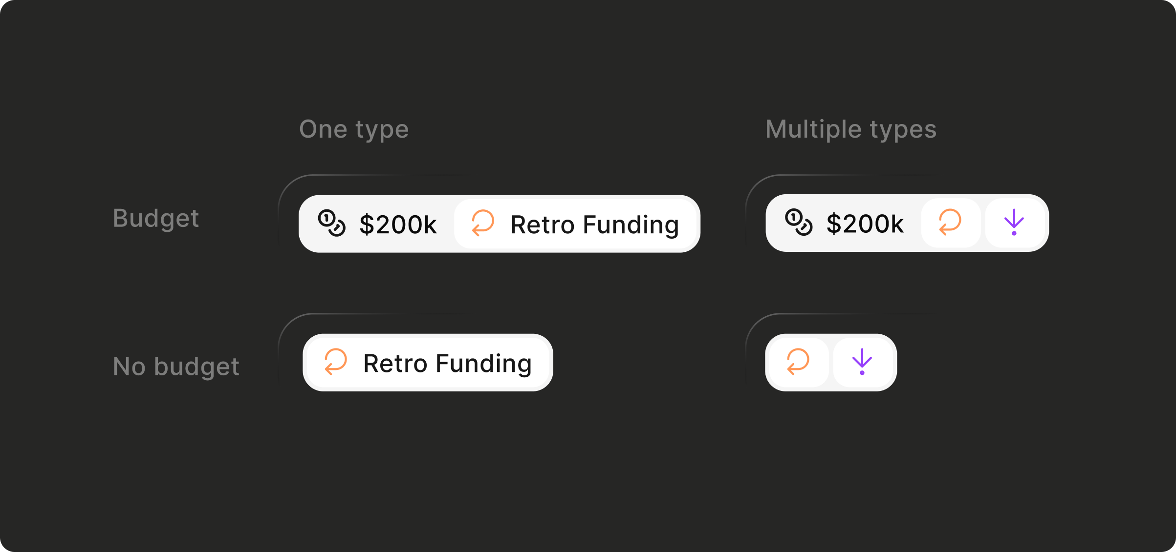
- Conditional routing by business tier (enterprise isolation vs network effects)
- "On Karma" badge creating visual hierarchy without demoting external programs
Problem
Two separate pages created fragmentation and lost conversion opportunities
Karma had two pages serving similar purposes but living in separate codebases, each with different routing behaviors:
Funding Map (marketing site). Builders browse all programs, click, and leave the site immediately. Even Karma-hosted programs bypassed their round pages, linking directly to external applications. Karma facilitated discovery but captured nothing downstream.
Live Rounds (app repository). Only Karma-hosted programs with proper routing through round pages to application. Correct flow, but an incomplete view of available opportunities.
External leakage without conversion capture
When builders discovered non-Karma programs through the Funding Map, they went straight to external application sites. No profile creation, no future applications, no reputation building.
Missing landing page infrastructure
Programs submitted to the directory didn't automatically generate landing pages. External programs linked directly out, and even Karma-hosted programs sometimes linked incorrectly because pages didn't exist until application forms were configured. No opportunity for cross-promotion, SEO, or conversion funnels.
Buried product differentiation
The directory looked like a generic funding aggregator. Builders couldn't tell which opportunities offered the premium Karma experience: easier application, profile integration, milestone tracking, and reputation portability. The value proposition was invisible.
"On Karma" badge in brand green for subtle visual hierarchy
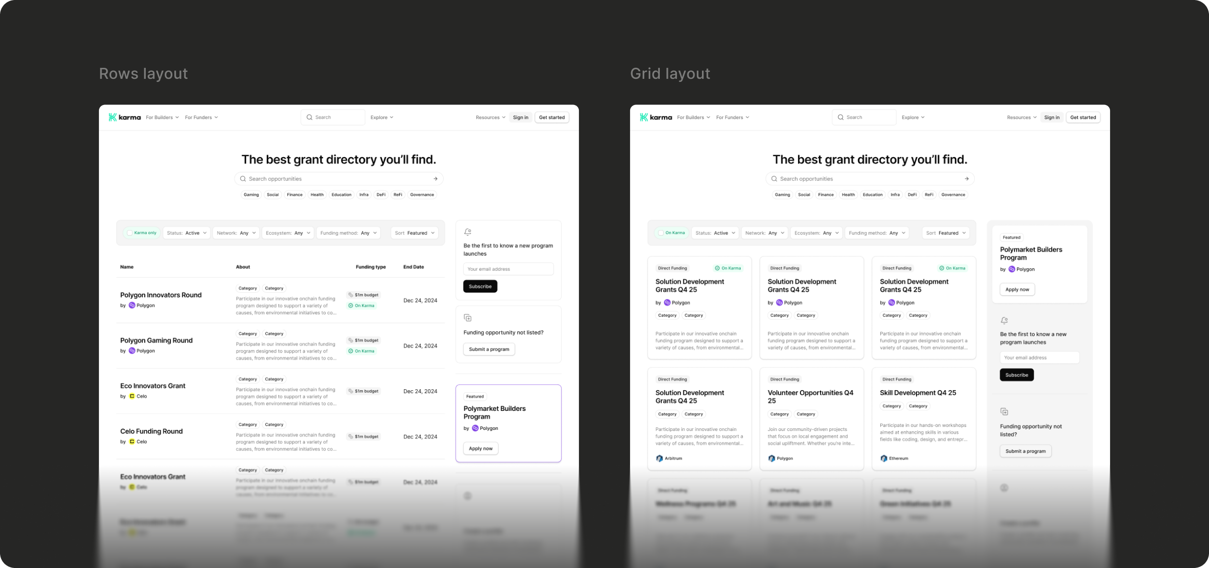
Cards over rows for better scannability, pattern familiarity, and mobile consistency
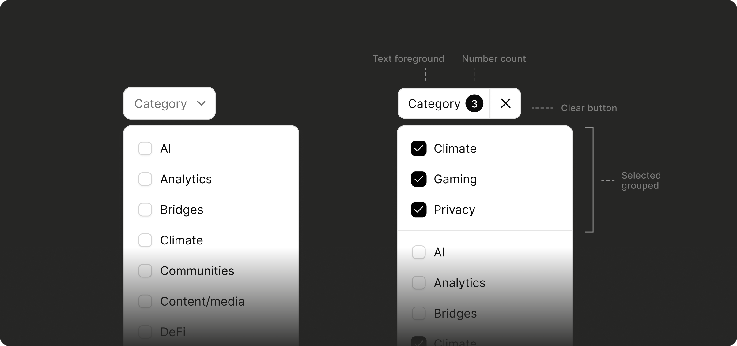
Multi-select filtering I designed and coded, replacing single-option system
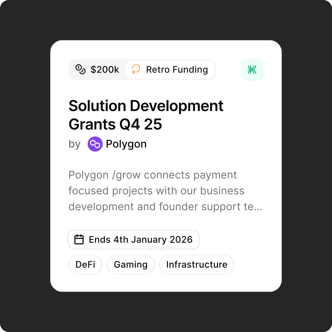
Refined card: subtle shadows, styled badges, clear typographic hierarchy
Solution
Unified discovery flow with consistent routing patterns
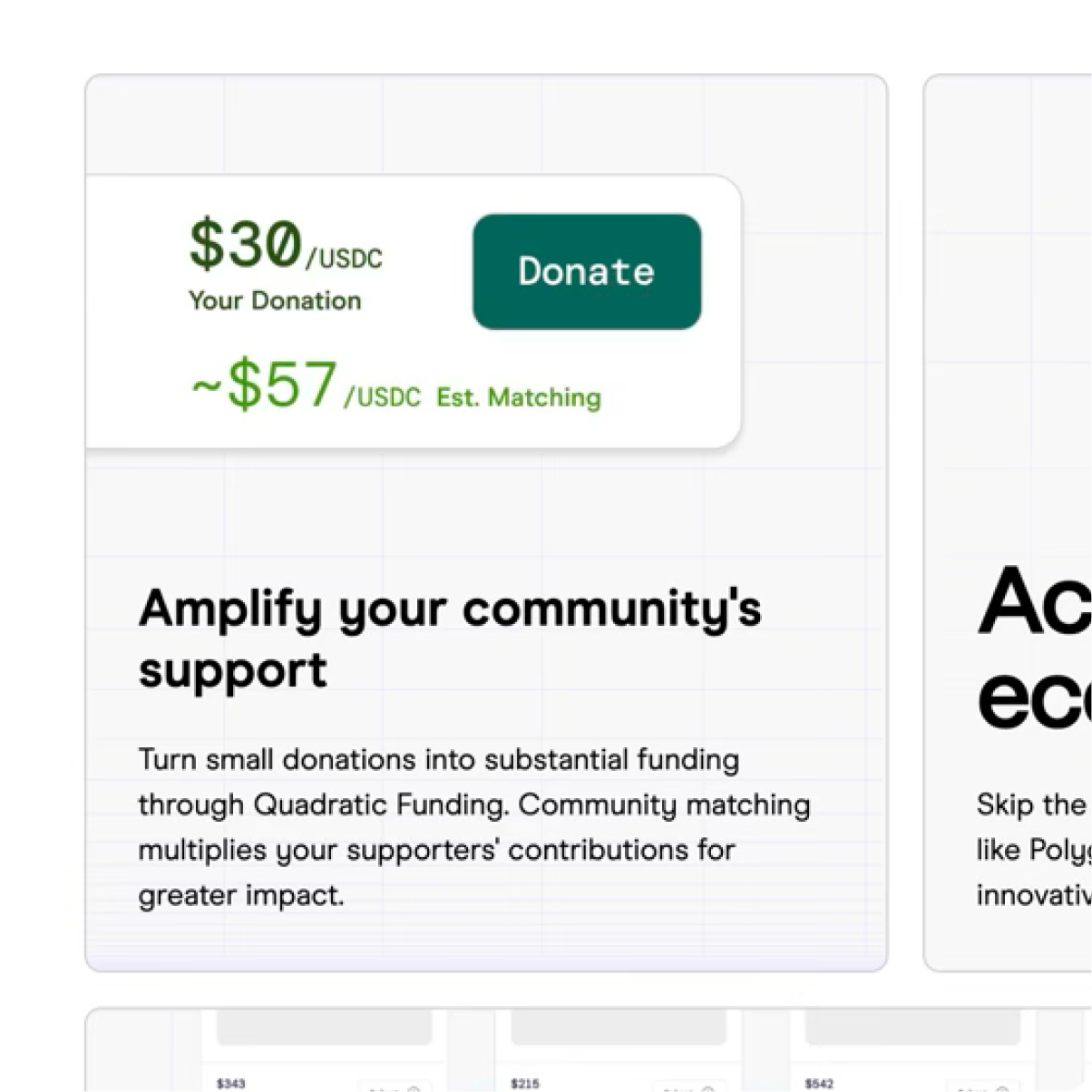
I consolidated two fragmented discovery experiences into a unified flow: Directory → Round page → Apply. All programs now route through dedicated round pages, which previously only existed for Karma-hosted programs. I extended them to external programs and made the directory route everything through these pages instead of linking directly out.
Creating a conversion layer that captures 100% of traffic
This creates a conversion layer intercepting 100% of directory traffic where none existed before. I also designed conditional routing by business tier: enterprise clients get isolated environments respecting their paid features, while non-enterprise programs include similar program recommendations to create network effects.
Advanced filtering and improved visual hierarchy
I designed and implemented multi-select filtering with routing logic, replacing the previous single-option system. The "On Karma" badge creates subtle visual hierarchy—noticeable when scanning but doesn't make external programs feel second-class. Early explorations used black borders or separate sections for Karma programs, but both were too disruptive.
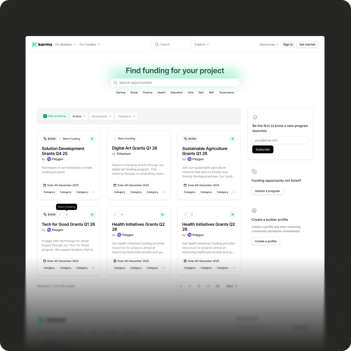
The unified directory with card grid, "Only on Karma" filter, and conversion sidebar
Results
Delivered in 2 weeks with production-ready code
Delivered in 2 weeks: unified discovery flow, multi-select filtering with routing logic, round pages for all programs, and conditional routing by business tier. I changed the brief from "redesign one page" to a full experience consolidation, a pattern in my work of looking at the broader system, not just the assigned page.
Technical implementation and design refinement
I implemented the filtering code myself; the frontend engineer confirmed it was production-ready on first review. The badge system is subtle: noticeable when scanning but doesn't make external programs feel second-class.